Instant Connection for Pixel Streaming
— New Feature Automated Setup

How to Use Photoshop Color Range for Better Color Selections
How to Use Photoshop Color Range for Better Color Selections
DigitalArt
How to Use Photoshop Color Range for Better Color Selections
Table of Contents
You click on a color in Photoshop and the selection goes completely off the rails. Too much gets selected. Or almost nothing. You tweak a slider, zoom in, try again. Same result.
Most people bounce between Magic Wand and Quick Selection at this point, hoping one of them suddenly behaves. Sometimes they do. Often, they don’t. Colors aren’t consistent across an image. Light, shadow, texture, compression, all of it changes what should be the “same” color.
This is usually where Color Range should step in. But a lot of users ignore it, or try it once, get a strange result, and move on. The dialog looks technical. The preview isn’t obvious. It doesn’t feel forgiving.
That’s a mistake.
Color Range is one of those tools that feels awkward until it clicks. Once it does, it solves problems other selection tools struggle with. Not by guessing what’s nearby, but by understanding color itself.
What Color Range Actually Does (And What It Doesn’t)
The easiest way to misunderstand Color Range is to think of it as a smarter Magic Wand. It’s not. It just solves a different problem.
Magic Wand and Quick Selection care a lot about where pixels are. You click here, Photoshop looks around that spot, and it expands the selection based on proximity and tolerance. That works fine when edges are clear and colors are clean. It falls apart the moment lighting gets uneven or textures get involved.
Color Range doesn’t really care where a pixel lives. It cares what that pixel is.
When you sample a color, you’re telling Photoshop, “Find pixels that look like this, anywhere in the image.” Not nearby. Not connected. Just similar in color value. That’s a big shift in how selections are built.
This is why Color Range is so good at things like skies, foliage, clothing, product colors, or subtle tonal ranges. The selection can jump across the canvas and still make sense. A blue patch in the corner and a blue patch in the center both get picked up, even if there’s a mountain or a person between them.
But here’s the part people don’t like hearing. Color Range isn’t precise by default. It’s broad. It works in ranges, not edges. If you expect it to trace a perfect outline around an object, you’re going to be disappointed.
It also struggles when colors overlap heavily. Think reflections, gradients, mixed lighting, or surfaces with lots of texture. If the color you want and the color you don’t want are basically cousins, Color Range won’t magically tell them apart.
In my experience, the tool works best when you treat it as a starting point, not a final answer. It gives you a smart, global selection based on color logic. You refine it after. That’s the deal.
Once you accept that, it becomes much easier to use. You stop asking it to do everything and start using it for what it’s actually good at.
If you’ve ever wondered whether your GPU is actually helping Photoshop or holding it back, this breakdown of the best GPU for Photoshop explains where performance gains really come from.
Opening Color Range and Understanding the Controls
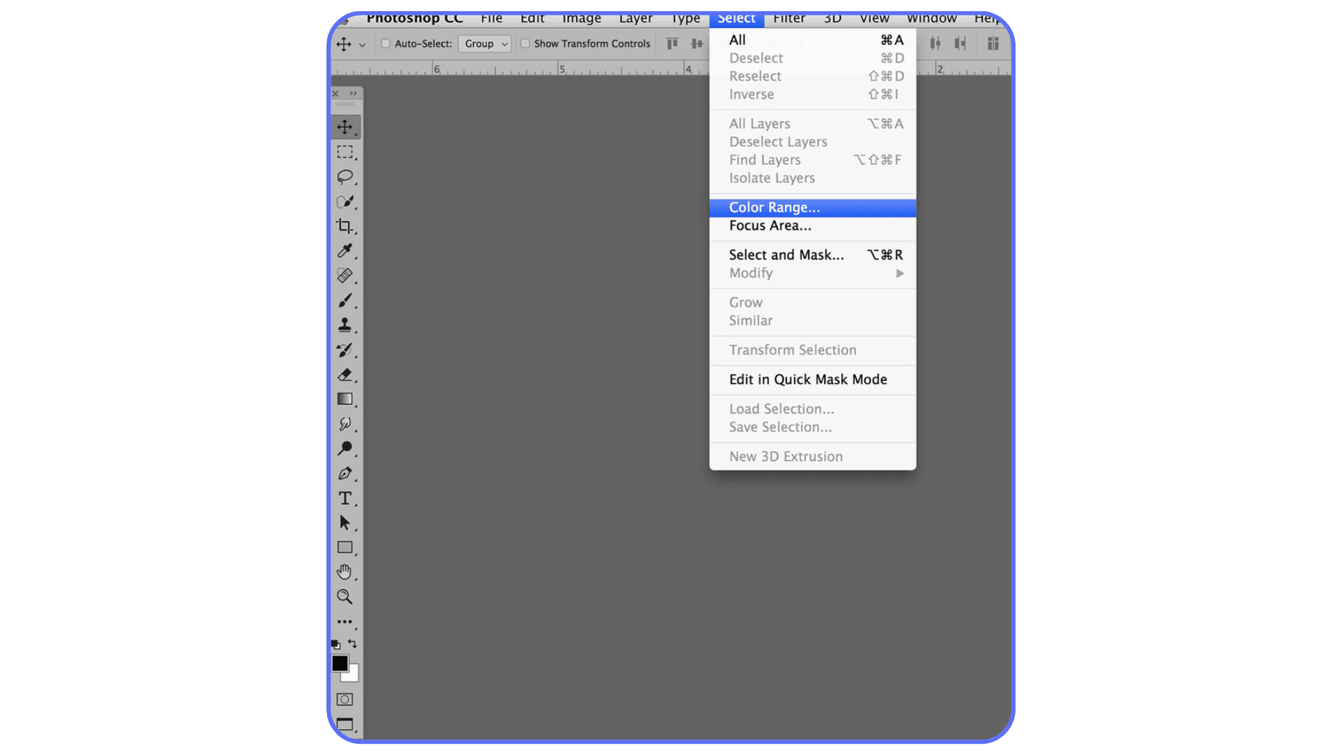
To open it, go to Select > Color Range. That’s it. No hidden shortcuts, no submenus buried three levels deep.
The dialog box looks a little intimidating at first, mostly because Photoshop throws a few concepts at you all at once. Don’t overthink it. There are really only three things you need to understand to get useful results.
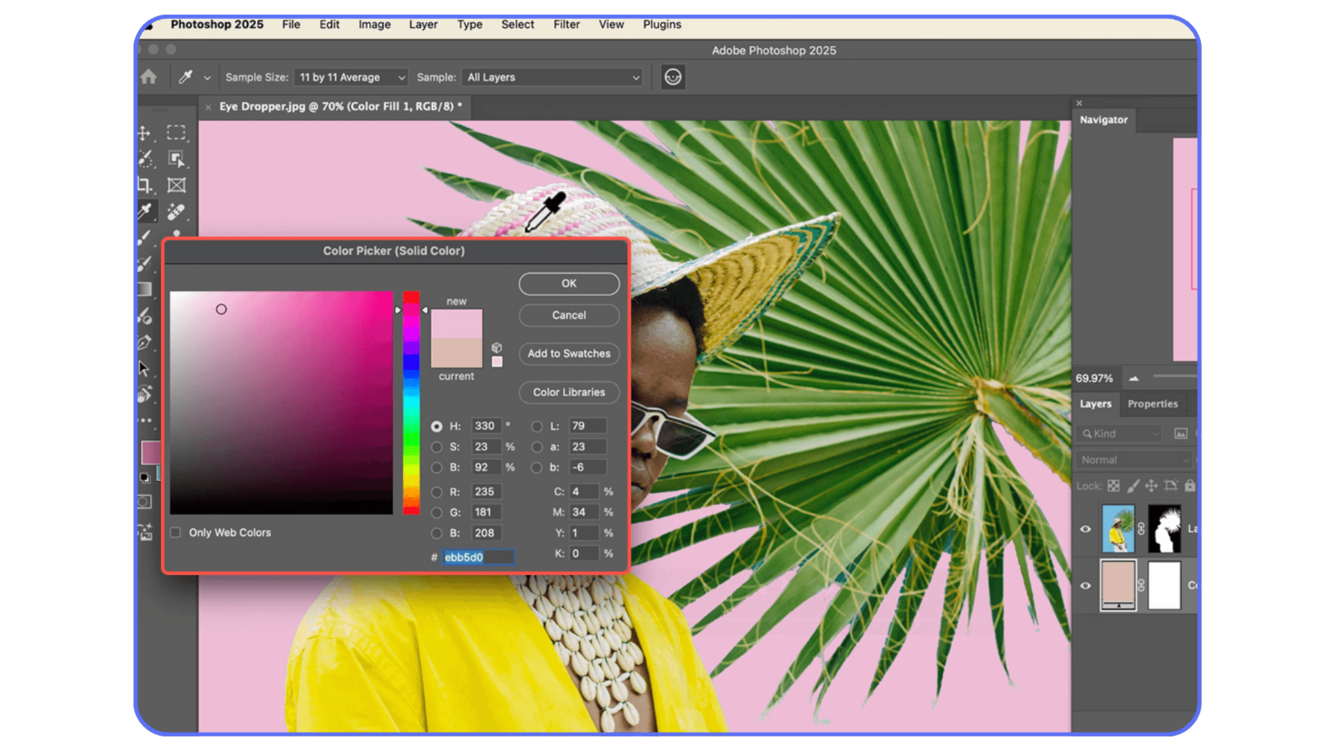
First, the Select dropdown. Most of the time, you’ll leave this on Sampled Colors. The presets like Reds, Highlights, or Skin Tones can be helpful, but they’re blunt instruments. Sampling manually gives you control, and control is the whole point of this tool.
Second, the eyedropper tools. The regular eyedropper adds a color sample. The plus eyedropper adds more colors to the same range. The minus eyedropper removes colors. This is where people usually rush. Don’t. Click deliberately. Watch the preview update. Small changes here matter more than big swings on any slider.
Third, Fuzziness. This slider decides how wide Photoshop casts the net. Low fuzziness means “stick close to this exact color.” Higher fuzziness means “include similar shades too.” There’s no perfect number. In practice, I start low, then slowly increase it until the important areas show up in the preview. If things I don’t want start appearing, I stop and subtract instead of pushing the slider further.
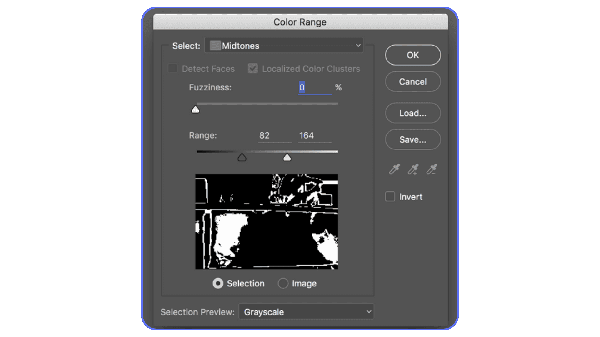
The preview window is your compass. White areas are selected. Black areas are not. Gray means partial selection. If you’re guessing instead of reading the preview, you’re flying blind.
One small habit that helps a lot: don’t chase perfection in this window. You’re not trying to get a flawless edge here. You’re trying to get a smart range. Cleanup comes later, and it’s much easier once the heavy lifting is done.
Once these controls stop feeling abstract, Color Range becomes predictable. And predictable tools are the ones you actually end up using.
Slowdowns often come hand-in-hand with instability, and many people don’t realize how common crashes are once files get complex. These common crash reasons for Photoshop usually show up right around this stage.
Real-World Use Cases That Actually Matter
This is where Color Range earns its place. Not in theory. In real edits where other tools start to feel clumsy.
Enhancing a sky without wrecking everything else
Classic scenario. You want more punch in the sky. More contrast, richer blues, maybe a subtle color shift. Quick Selection grabs buildings and faces. Magic Wand leaves holes. Color Range handles this better because skies usually share a loose color family, even when clouds and gradients complicate things.
Sample a mid-blue area, slowly raise Fuzziness until most of the sky shows up in the preview, then stop. Don’t chase the clouds yet. Hit OK, add a Hue/Saturation or Curves adjustment, and make your changes. If clouds need protection, you mask them out afterward. Faster. Cleaner. Less frustration.
Recoloring clothing or objects
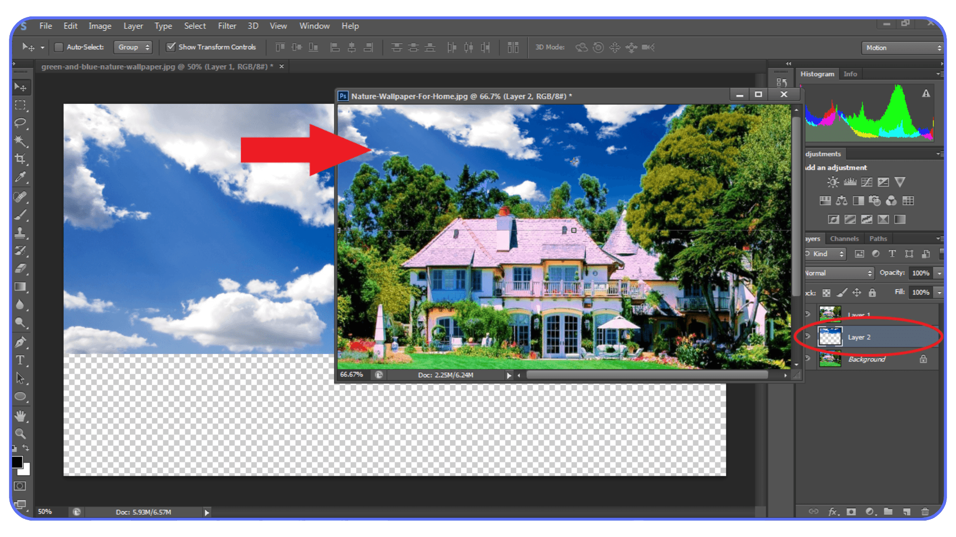
Clothing is rarely one flat color. Fabric folds, shadows, highlights, texture. That’s where Color Range shines. Instead of trying to trace the outline of a shirt, you let Photoshop grab the color family itself.
I usually sample a midtone area, then add samples from darker folds and lighter highlights using the plus eyedropper. The preview tells you when you’ve covered enough. Once selected, a Hue/Saturation adjustment gives you full control without repainting anything by hand.
Does it always work perfectly? No. Logos, seams, or mixed fabrics can cause issues. But as a starting point, it’s miles better than manual selection.
The same approach even makes it possible to run full Photoshop on devices that normally couldn’t handle it, like running Adobe Photoshop on a Chromebook.
Targeting highlights or shadows for subtle grading
This one’s underrated. Using Color Range to select Highlights or Shadows lets you shape contrast in a way that feels controlled, not heavy-handed. It’s especially useful for product shots and portraits where global contrast adjustments feel too aggressive.
You’re not isolating an object here. You’re isolating a tonal behavior. That mental shift matters.
Across all these cases, the pattern is the same. Color Range isn’t about precision at the pixel level. It’s about intention. You define the color logic. Photoshop handles the boring part.
It’s especially relevant if you’re working on a system without dedicated graphics. There are still ways to run Photoshop smoothly without a GPU, as long as the workload is handled somewhere smarter.
Refining the Selection Without Losing Your Mind
This is the part that separates “Color Range kind of works” from “why didn’t I use this sooner.”
The biggest mistake I see is people trying to solve everything with the Fuzziness slider. They keep pushing it higher until the preview looks full, then wonder why half the image is selected. That slider isn’t a volume knob. It’s more like a tolerance boundary. Once it starts pulling in junk, stop.
Instead, rely on adding and subtracting samples. If an important area is missing, add it with the plus eyedropper. If something unwanted shows up, remove it with the minus. This keeps the range tight while still covering variation. It’s slower, but it’s controlled. Control wins here.
Another underrated move is limiting the area before you even open Color Range. Make a rough Lasso selection around the region you care about, then run Color Range. Photoshop will only look inside that area. This single step can cut selection noise in half, especially when the same color appears elsewhere in the image.
Pay attention to the preview, not the canvas. The preview is honest. The canvas can lie, especially at low zoom levels. White is selected. Black is not. Gray is partial. If you learn to read that language, you’ll know when to stop tweaking.
And here’s something that took me a while to accept. You don’t need a perfect selection here. You need a useful one. Chasing perfection at this stage usually makes things worse. Get close, commit, and move on to masking.
Once you trust that cleanup comes later, Color Range stops feeling fragile and starts feeling fast.
If you’re comparing upgrades, this overview of the best PC and laptop for Photoshop shows why specs alone don’t always translate to smoother real-world performance.
Turning Selections Into Clean, Flexible Masks
A Color Range selection on its own isn’t the goal. The goal is what you do with it next.
Most of the time, that means turning it into a layer mask. Adjustment layers are your friend here. They keep things editable and they forgive mistakes. Once the selection is active, add an adjustment layer and let Photoshop convert that selection into a mask automatically.
Now comes the part people either overthink or rush through. Mask cleanup.
Click on the mask thumbnail and grab a soft brush. Paint with black to hide areas. White to reveal them again. Low opacity helps. You’re not carving stone here. You’re nudging the mask into shape. This is where Color Range and manual control meet in a very comfortable middle ground.
One thing I’ve noticed over the years is that people assume precision tools are always better for masks. They’re not. A soft brush at 20 or 30 percent opacity often produces more natural results than perfectly sharp edges, especially with hair, fabric, clouds, or foliage. Real life isn’t razor sharp. Your masks don’t need to be either.
If edges look muddy or haloed, zoom in and check the mask directly. Hold Alt or Option and click the mask thumbnail to view it in black and white. Problems become obvious instantly. Fix them there instead of guessing on the image itself.
The key mindset shift is this. Color Range gives you a smart head start. Masking is where you finish the job. Once you stop expecting either one to do everything alone, the workflow becomes surprisingly relaxed.
A lot of that slowdown comes from how Photoshop uses hardware, especially the GPU. This guide on how to use GPU on Adobe Photoshop breaks down what actually accelerates tasks like previews, masks, and adjustments.
Using Vagon Cloud Computer When Photoshop Starts Slowing You Down
At a certain point, the problem isn’t Color Range. It’s your hardware.
Color Range selections often sit inside heavy Photoshop files. Large canvases. Multiple adjustment layers. Smart Objects. Add AI-based tools into the mix and suddenly every small action takes longer than it should. Previews lag. Masks update slowly. Sliders feel delayed instead of responsive.
That friction changes how you work. You experiment less. You settle sooner. Not because the edit is finished, but because waiting for Photoshop to catch up gets tiring.
This is where Vagon Cloud Computer comes in as a very practical option. Instead of relying on your local machine, you run Photoshop on a high-performance cloud computer and stream it to whatever device you’re using.
The difference shows up immediately in workflows like Color Range. The preview updates smoothly. Refining selections doesn’t stutter. Large PSD files behave like they should. You can push adjustments, undo, tweak, and explore without worrying about lag.
What I like about this setup is that it doesn’t change how you use Photoshop. You still work the same way. You just remove the hardware ceiling that usually appears once your projects get more complex.
If Color Range is part of your regular workflow and performance has been holding you back, this kind of setup lets the tool shine instead of feeling like a chore.
This also matters if you’re working across devices. Running Photoshop remotely opens up options beyond desktops, similar to what people explore when learning how to use Photoshop on iPad without sacrificing serious workflows.
Final Thoughts
Color Range isn’t flashy. It doesn’t feel modern in the way AI selections do. And it definitely doesn’t hold your hand. That’s probably why a lot of Photoshop users never fully adopt it.
But once you understand how it thinks, it earns your trust.
It teaches you to stop chasing perfect edges and start working with color logic. It rewards patience, not brute force. And it fits surprisingly well into real workflows, especially when you pair it with masks and adjustment layers instead of treating it like a one-click solution.
I think that’s the real value here. Color Range doesn’t replace other selection tools. It complements them. It gives you a smarter starting point when color, not shape, is the real problem you’re trying to solve.
And when performance stops getting in the way, whether that’s through better hardware or a cloud setup, you’re free to experiment. To test variations. To undo without hesitation. That’s when tools like this stop feeling technical and start feeling creative.
If you’ve skipped Color Range in the past, it’s worth another look. Not because it’s new. Because it quietly does its job very well.
FAQs
1. Why does Color Range select areas I didn’t click on?
Because it’s not selecting based on location. It’s selecting based on color similarity across the entire image. If the same color appears in multiple places, Photoshop will grab all of them unless you limit the area first or subtract samples.
2. What’s a good Fuzziness value to start with?
There isn’t a magic number, but starting low usually works better. I often begin somewhere around 20–40 and increase slowly. If you push it high right away, you’ll lose control fast.
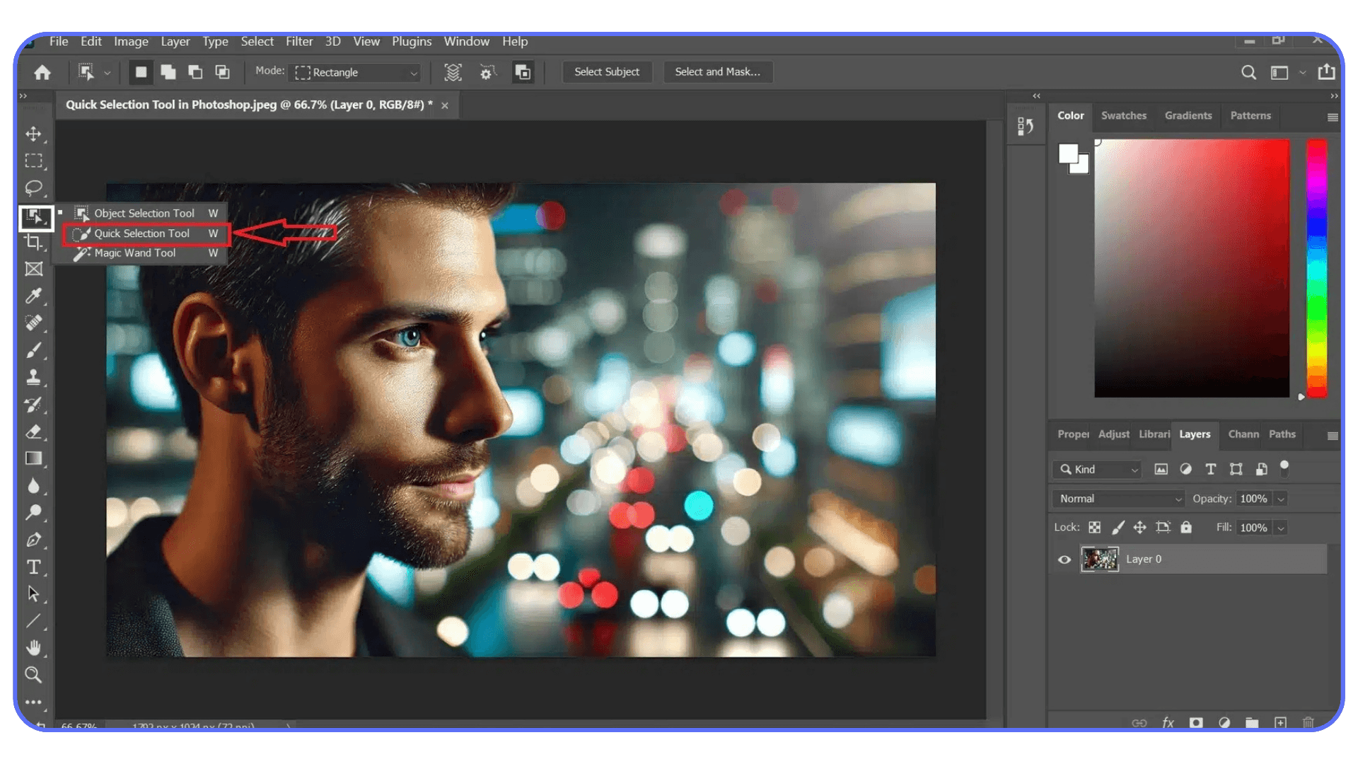
3. Should I use Color Range or Magic Wand?
If your problem is color consistency across the image, Color Range is usually the better choice. If you need fast, localized selections with clear edges, Magic Wand or Quick Selection can be quicker. They solve different problems.
4. Why do my edges look rough or muddy after using Color Range?
That usually happens when the selection is doing too much work. Color Range is meant to create a smart base, not a finished mask. Convert it to a layer mask and clean it up manually with a soft brush.
5. Can I use Color Range with adjustment layers?
Yes, and you should. That’s one of the best ways to use it. The selection becomes a mask automatically, which keeps everything editable and forgiving.
6. When should I avoid Color Range entirely?
If the colors you want and don’t want are very similar, or if you’re dealing with heavy gradients, reflections, or mixed lighting, Color Range can struggle. In those cases, manual masking or AI-based selections often work better.
7. Is Color Range still useful with newer AI selection tools?
Absolutely. AI tools are great for objects and subjects. Color Range still shines when color itself is the thing you’re targeting. They work best when you treat them as complementary, not competing tools.
You click on a color in Photoshop and the selection goes completely off the rails. Too much gets selected. Or almost nothing. You tweak a slider, zoom in, try again. Same result.
Most people bounce between Magic Wand and Quick Selection at this point, hoping one of them suddenly behaves. Sometimes they do. Often, they don’t. Colors aren’t consistent across an image. Light, shadow, texture, compression, all of it changes what should be the “same” color.
This is usually where Color Range should step in. But a lot of users ignore it, or try it once, get a strange result, and move on. The dialog looks technical. The preview isn’t obvious. It doesn’t feel forgiving.
That’s a mistake.
Color Range is one of those tools that feels awkward until it clicks. Once it does, it solves problems other selection tools struggle with. Not by guessing what’s nearby, but by understanding color itself.
What Color Range Actually Does (And What It Doesn’t)
The easiest way to misunderstand Color Range is to think of it as a smarter Magic Wand. It’s not. It just solves a different problem.
Magic Wand and Quick Selection care a lot about where pixels are. You click here, Photoshop looks around that spot, and it expands the selection based on proximity and tolerance. That works fine when edges are clear and colors are clean. It falls apart the moment lighting gets uneven or textures get involved.
Color Range doesn’t really care where a pixel lives. It cares what that pixel is.
When you sample a color, you’re telling Photoshop, “Find pixels that look like this, anywhere in the image.” Not nearby. Not connected. Just similar in color value. That’s a big shift in how selections are built.
This is why Color Range is so good at things like skies, foliage, clothing, product colors, or subtle tonal ranges. The selection can jump across the canvas and still make sense. A blue patch in the corner and a blue patch in the center both get picked up, even if there’s a mountain or a person between them.
But here’s the part people don’t like hearing. Color Range isn’t precise by default. It’s broad. It works in ranges, not edges. If you expect it to trace a perfect outline around an object, you’re going to be disappointed.
It also struggles when colors overlap heavily. Think reflections, gradients, mixed lighting, or surfaces with lots of texture. If the color you want and the color you don’t want are basically cousins, Color Range won’t magically tell them apart.
In my experience, the tool works best when you treat it as a starting point, not a final answer. It gives you a smart, global selection based on color logic. You refine it after. That’s the deal.
Once you accept that, it becomes much easier to use. You stop asking it to do everything and start using it for what it’s actually good at.
If you’ve ever wondered whether your GPU is actually helping Photoshop or holding it back, this breakdown of the best GPU for Photoshop explains where performance gains really come from.
Opening Color Range and Understanding the Controls
To open it, go to Select > Color Range. That’s it. No hidden shortcuts, no submenus buried three levels deep.
The dialog box looks a little intimidating at first, mostly because Photoshop throws a few concepts at you all at once. Don’t overthink it. There are really only three things you need to understand to get useful results.
First, the Select dropdown. Most of the time, you’ll leave this on Sampled Colors. The presets like Reds, Highlights, or Skin Tones can be helpful, but they’re blunt instruments. Sampling manually gives you control, and control is the whole point of this tool.
Second, the eyedropper tools. The regular eyedropper adds a color sample. The plus eyedropper adds more colors to the same range. The minus eyedropper removes colors. This is where people usually rush. Don’t. Click deliberately. Watch the preview update. Small changes here matter more than big swings on any slider.
Third, Fuzziness. This slider decides how wide Photoshop casts the net. Low fuzziness means “stick close to this exact color.” Higher fuzziness means “include similar shades too.” There’s no perfect number. In practice, I start low, then slowly increase it until the important areas show up in the preview. If things I don’t want start appearing, I stop and subtract instead of pushing the slider further.
The preview window is your compass. White areas are selected. Black areas are not. Gray means partial selection. If you’re guessing instead of reading the preview, you’re flying blind.
One small habit that helps a lot: don’t chase perfection in this window. You’re not trying to get a flawless edge here. You’re trying to get a smart range. Cleanup comes later, and it’s much easier once the heavy lifting is done.
Once these controls stop feeling abstract, Color Range becomes predictable. And predictable tools are the ones you actually end up using.
Slowdowns often come hand-in-hand with instability, and many people don’t realize how common crashes are once files get complex. These common crash reasons for Photoshop usually show up right around this stage.
Real-World Use Cases That Actually Matter
This is where Color Range earns its place. Not in theory. In real edits where other tools start to feel clumsy.
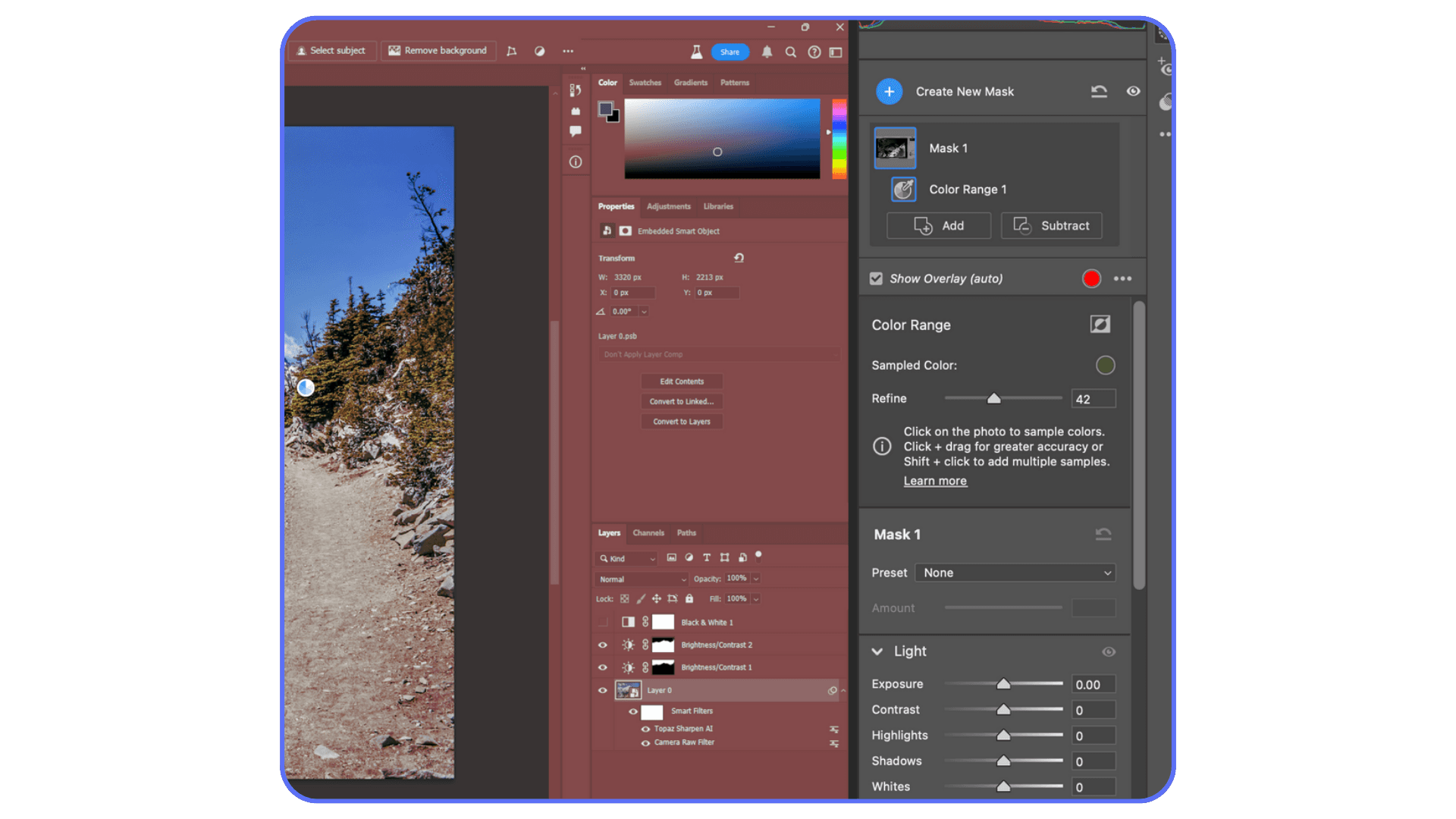
Enhancing a sky without wrecking everything else
Classic scenario. You want more punch in the sky. More contrast, richer blues, maybe a subtle color shift. Quick Selection grabs buildings and faces. Magic Wand leaves holes. Color Range handles this better because skies usually share a loose color family, even when clouds and gradients complicate things.
Sample a mid-blue area, slowly raise Fuzziness until most of the sky shows up in the preview, then stop. Don’t chase the clouds yet. Hit OK, add a Hue/Saturation or Curves adjustment, and make your changes. If clouds need protection, you mask them out afterward. Faster. Cleaner. Less frustration.
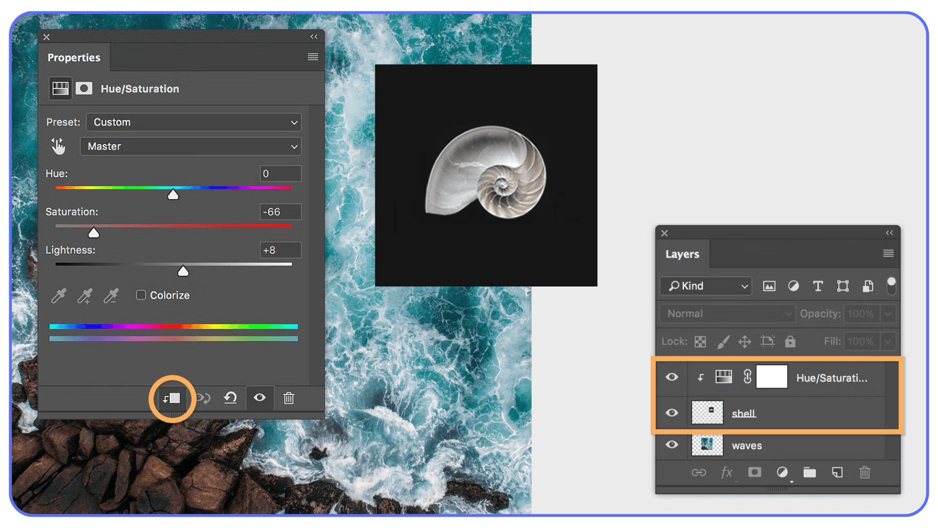
Recoloring clothing or objects
Clothing is rarely one flat color. Fabric folds, shadows, highlights, texture. That’s where Color Range shines. Instead of trying to trace the outline of a shirt, you let Photoshop grab the color family itself.
I usually sample a midtone area, then add samples from darker folds and lighter highlights using the plus eyedropper. The preview tells you when you’ve covered enough. Once selected, a Hue/Saturation adjustment gives you full control without repainting anything by hand.
Does it always work perfectly? No. Logos, seams, or mixed fabrics can cause issues. But as a starting point, it’s miles better than manual selection.
The same approach even makes it possible to run full Photoshop on devices that normally couldn’t handle it, like running Adobe Photoshop on a Chromebook.
Targeting highlights or shadows for subtle grading
This one’s underrated. Using Color Range to select Highlights or Shadows lets you shape contrast in a way that feels controlled, not heavy-handed. It’s especially useful for product shots and portraits where global contrast adjustments feel too aggressive.
You’re not isolating an object here. You’re isolating a tonal behavior. That mental shift matters.
Across all these cases, the pattern is the same. Color Range isn’t about precision at the pixel level. It’s about intention. You define the color logic. Photoshop handles the boring part.
It’s especially relevant if you’re working on a system without dedicated graphics. There are still ways to run Photoshop smoothly without a GPU, as long as the workload is handled somewhere smarter.
Refining the Selection Without Losing Your Mind
This is the part that separates “Color Range kind of works” from “why didn’t I use this sooner.”
The biggest mistake I see is people trying to solve everything with the Fuzziness slider. They keep pushing it higher until the preview looks full, then wonder why half the image is selected. That slider isn’t a volume knob. It’s more like a tolerance boundary. Once it starts pulling in junk, stop.
Instead, rely on adding and subtracting samples. If an important area is missing, add it with the plus eyedropper. If something unwanted shows up, remove it with the minus. This keeps the range tight while still covering variation. It’s slower, but it’s controlled. Control wins here.
Another underrated move is limiting the area before you even open Color Range. Make a rough Lasso selection around the region you care about, then run Color Range. Photoshop will only look inside that area. This single step can cut selection noise in half, especially when the same color appears elsewhere in the image.
Pay attention to the preview, not the canvas. The preview is honest. The canvas can lie, especially at low zoom levels. White is selected. Black is not. Gray is partial. If you learn to read that language, you’ll know when to stop tweaking.
And here’s something that took me a while to accept. You don’t need a perfect selection here. You need a useful one. Chasing perfection at this stage usually makes things worse. Get close, commit, and move on to masking.
Once you trust that cleanup comes later, Color Range stops feeling fragile and starts feeling fast.
If you’re comparing upgrades, this overview of the best PC and laptop for Photoshop shows why specs alone don’t always translate to smoother real-world performance.
Turning Selections Into Clean, Flexible Masks
A Color Range selection on its own isn’t the goal. The goal is what you do with it next.
Most of the time, that means turning it into a layer mask. Adjustment layers are your friend here. They keep things editable and they forgive mistakes. Once the selection is active, add an adjustment layer and let Photoshop convert that selection into a mask automatically.
Now comes the part people either overthink or rush through. Mask cleanup.
Click on the mask thumbnail and grab a soft brush. Paint with black to hide areas. White to reveal them again. Low opacity helps. You’re not carving stone here. You’re nudging the mask into shape. This is where Color Range and manual control meet in a very comfortable middle ground.
One thing I’ve noticed over the years is that people assume precision tools are always better for masks. They’re not. A soft brush at 20 or 30 percent opacity often produces more natural results than perfectly sharp edges, especially with hair, fabric, clouds, or foliage. Real life isn’t razor sharp. Your masks don’t need to be either.
If edges look muddy or haloed, zoom in and check the mask directly. Hold Alt or Option and click the mask thumbnail to view it in black and white. Problems become obvious instantly. Fix them there instead of guessing on the image itself.
The key mindset shift is this. Color Range gives you a smart head start. Masking is where you finish the job. Once you stop expecting either one to do everything alone, the workflow becomes surprisingly relaxed.
A lot of that slowdown comes from how Photoshop uses hardware, especially the GPU. This guide on how to use GPU on Adobe Photoshop breaks down what actually accelerates tasks like previews, masks, and adjustments.
Using Vagon Cloud Computer When Photoshop Starts Slowing You Down
At a certain point, the problem isn’t Color Range. It’s your hardware.
Color Range selections often sit inside heavy Photoshop files. Large canvases. Multiple adjustment layers. Smart Objects. Add AI-based tools into the mix and suddenly every small action takes longer than it should. Previews lag. Masks update slowly. Sliders feel delayed instead of responsive.
That friction changes how you work. You experiment less. You settle sooner. Not because the edit is finished, but because waiting for Photoshop to catch up gets tiring.
This is where Vagon Cloud Computer comes in as a very practical option. Instead of relying on your local machine, you run Photoshop on a high-performance cloud computer and stream it to whatever device you’re using.
The difference shows up immediately in workflows like Color Range. The preview updates smoothly. Refining selections doesn’t stutter. Large PSD files behave like they should. You can push adjustments, undo, tweak, and explore without worrying about lag.
What I like about this setup is that it doesn’t change how you use Photoshop. You still work the same way. You just remove the hardware ceiling that usually appears once your projects get more complex.
If Color Range is part of your regular workflow and performance has been holding you back, this kind of setup lets the tool shine instead of feeling like a chore.
This also matters if you’re working across devices. Running Photoshop remotely opens up options beyond desktops, similar to what people explore when learning how to use Photoshop on iPad without sacrificing serious workflows.
Final Thoughts
Color Range isn’t flashy. It doesn’t feel modern in the way AI selections do. And it definitely doesn’t hold your hand. That’s probably why a lot of Photoshop users never fully adopt it.
But once you understand how it thinks, it earns your trust.
It teaches you to stop chasing perfect edges and start working with color logic. It rewards patience, not brute force. And it fits surprisingly well into real workflows, especially when you pair it with masks and adjustment layers instead of treating it like a one-click solution.
I think that’s the real value here. Color Range doesn’t replace other selection tools. It complements them. It gives you a smarter starting point when color, not shape, is the real problem you’re trying to solve.
And when performance stops getting in the way, whether that’s through better hardware or a cloud setup, you’re free to experiment. To test variations. To undo without hesitation. That’s when tools like this stop feeling technical and start feeling creative.
If you’ve skipped Color Range in the past, it’s worth another look. Not because it’s new. Because it quietly does its job very well.
FAQs
1. Why does Color Range select areas I didn’t click on?
Because it’s not selecting based on location. It’s selecting based on color similarity across the entire image. If the same color appears in multiple places, Photoshop will grab all of them unless you limit the area first or subtract samples.
2. What’s a good Fuzziness value to start with?
There isn’t a magic number, but starting low usually works better. I often begin somewhere around 20–40 and increase slowly. If you push it high right away, you’ll lose control fast.
3. Should I use Color Range or Magic Wand?
If your problem is color consistency across the image, Color Range is usually the better choice. If you need fast, localized selections with clear edges, Magic Wand or Quick Selection can be quicker. They solve different problems.
4. Why do my edges look rough or muddy after using Color Range?
That usually happens when the selection is doing too much work. Color Range is meant to create a smart base, not a finished mask. Convert it to a layer mask and clean it up manually with a soft brush.
5. Can I use Color Range with adjustment layers?
Yes, and you should. That’s one of the best ways to use it. The selection becomes a mask automatically, which keeps everything editable and forgiving.
6. When should I avoid Color Range entirely?
If the colors you want and don’t want are very similar, or if you’re dealing with heavy gradients, reflections, or mixed lighting, Color Range can struggle. In those cases, manual masking or AI-based selections often work better.
7. Is Color Range still useful with newer AI selection tools?
Absolutely. AI tools are great for objects and subjects. Color Range still shines when color itself is the thing you’re targeting. They work best when you treat them as complementary, not competing tools.
Get Beyond Your Computer Performance
Run applications on your cloud computer with the latest generation hardware. No more crashes or lags.

Trial includes 1 hour usage + 7 days of storage.
Summarize with AI

Ready to focus on your creativity?
Vagon gives you the ability to create & render projects, collaborate, and stream applications with the power of the best hardware.

Vagon Blog


Run heavy applications on any device with
your personal computer on the cloud.
San Francisco, California
Solutions
Vagon Teams
Vagon Streams
Use Cases
Resources
Vagon Blog
What Slows Down After Effects Projects?
The First 30 Minutes in Blender 3D: A Practical Workflow Guide
What’s New in Godot 4.7? Key Features, Upgrades, and Workflow Improvements
What Slows Down Blender 3D Projects?
What Slows Down Adobe Photoshop Projects?
The First 30 Minutes in Adobe Photoshop: A Practical Workflow Guide
Before You Start in Adobe Photoshop: A Practical Setup Checklist
What’s New in Unreal Engine 5.8? Key Features and Upgrade Advice
How to Run Windows on an iPad: 4 Best Ways (2026)
Vagon Blog
Run heavy applications on any device with
your personal computer on the cloud.
San Francisco, California
Solutions
Vagon Teams
Vagon Streams
Use Cases
Resources
Vagon Blog